Upon the commencement of my employment at the International Bar Association, I was tasked with helping to redesign and develop the company website. With my main focus on the website’s design as well as its look and feel. The website initially had a site upgrade from what used to be very primitive, with tables forming the backbone of the site’s markup.
Liaising with the back-end team and web developer, a new template was created integrating the functionality of Bootstrap 3 into the site. This meant that all previous pages would need to be updated and redesigned so that we maximised the full use of Bootstrap 3’s functionality and responsive capabilities.
I was tasked with updating current pages of the site along with creating new ones which meant I was responsible for overhauling every facet of their design, including the styling of navigations, content-boxes, sliders and background-images to take advantage of the new full-width capabilities.
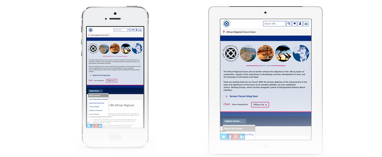
The end result is a site that is now fully responsive and up-to-date with modern web standards and functionality.
View current website: www.ibanet.org
Work at the IBA
During my time at the IBA, I was tasked with many projects and varying briefs. It could be anything from creating new webpages, updating existing ones, creating new banner images for web pages or sliders, info graphics, etc.
Banner Designs
Sydney 2017
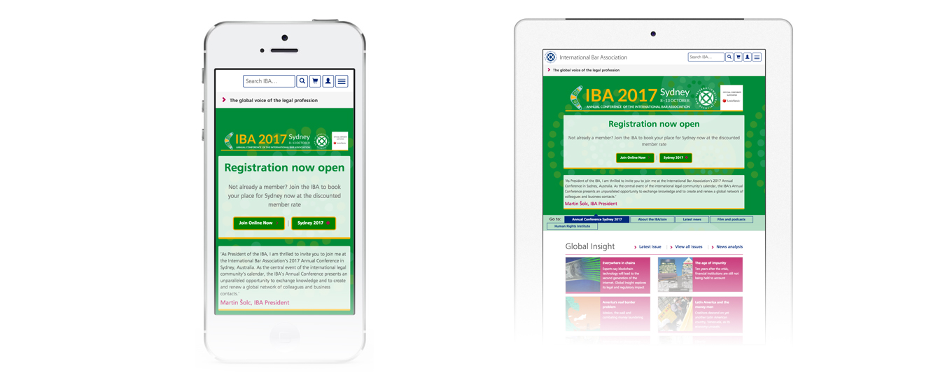
Every year the IBA holds an Annual Conference, this year it takes places in Sydney, Australia. So making sure that it is at the forefront of the site, I was tasked with creating a banner image to promote it. I initially mocked out this initial design in Photoshop:

It looked and worked great in the space, and would link straight through to the corresponding Annual Conference site. But with it being just a static image it wouldn’t work as well on smaller devices. Therefore, so that the responsive functionality of Bootstrap could be used to the max, I decided to re-create this banner in HTML/CSS. This not only allowed the content to be displayed on various devices, but in case any amendments were needed within the text this could then be easily done within the CMS system. Also by having the banner created in this form, URL links and buttons could also be easily added in too.
Other Banner Designs
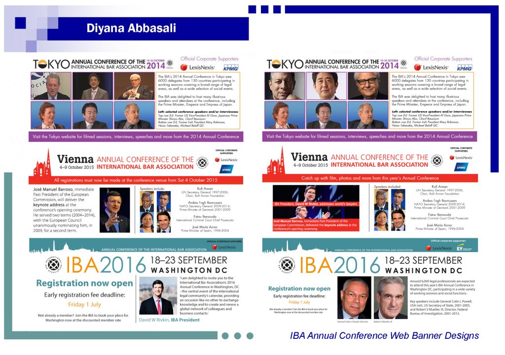
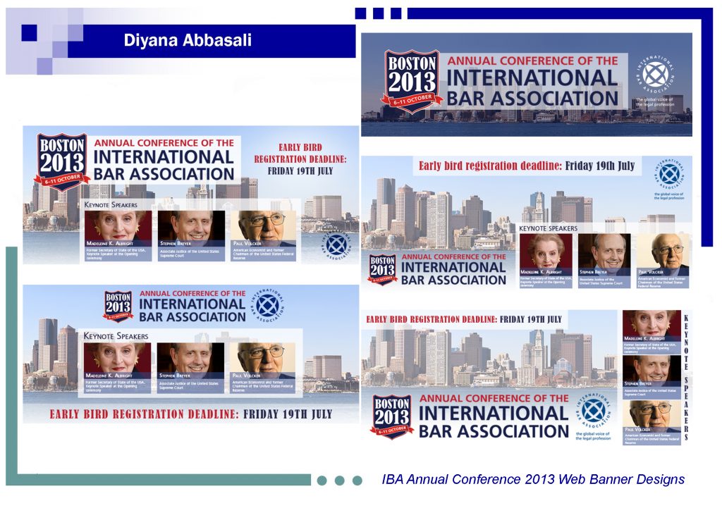
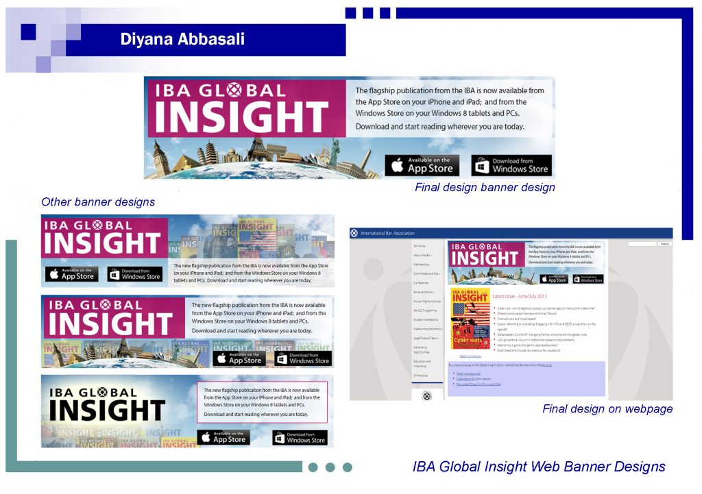
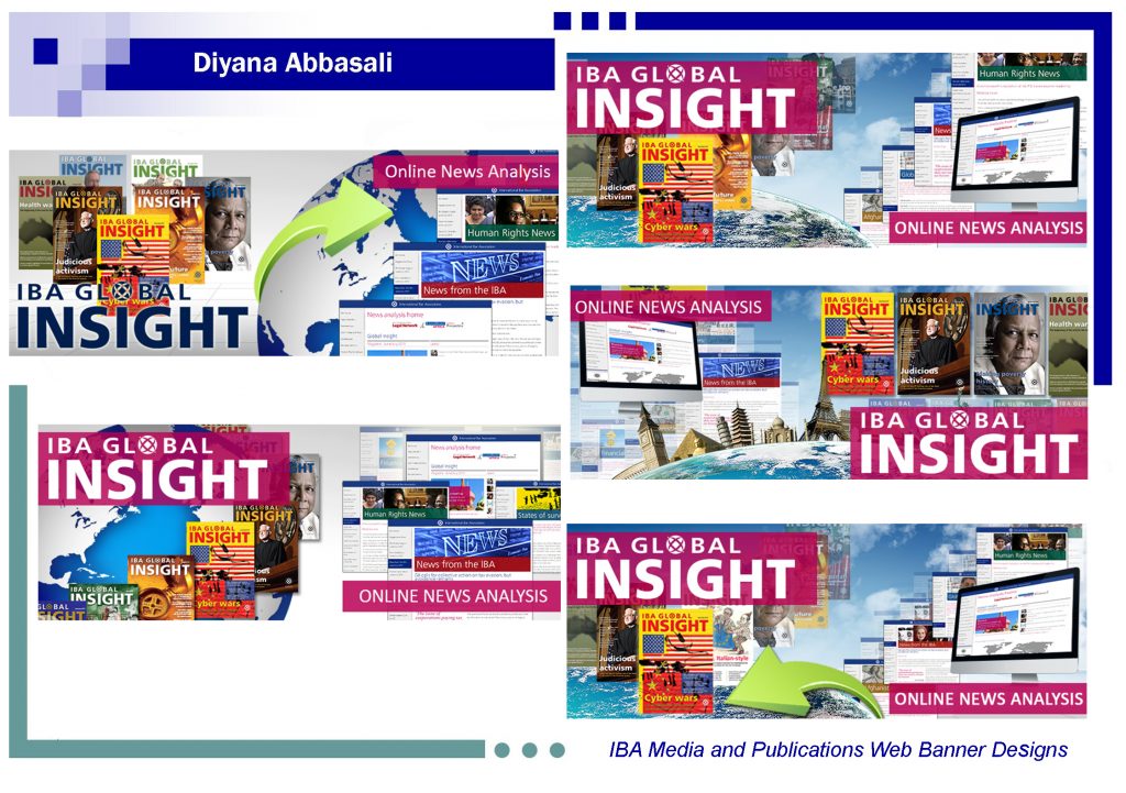
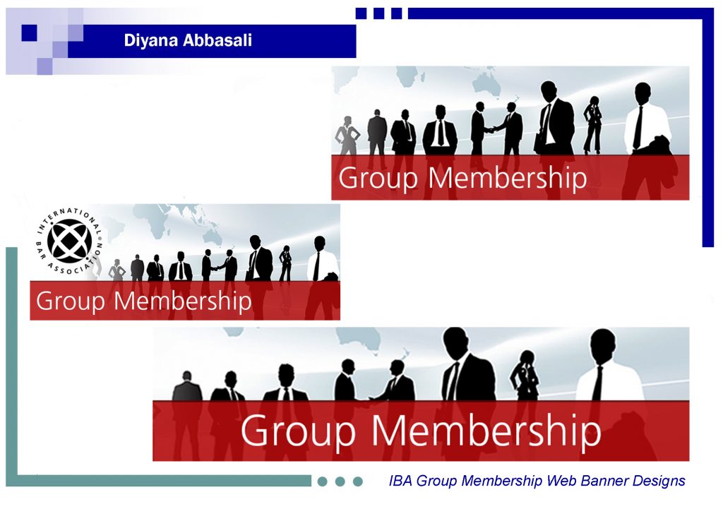
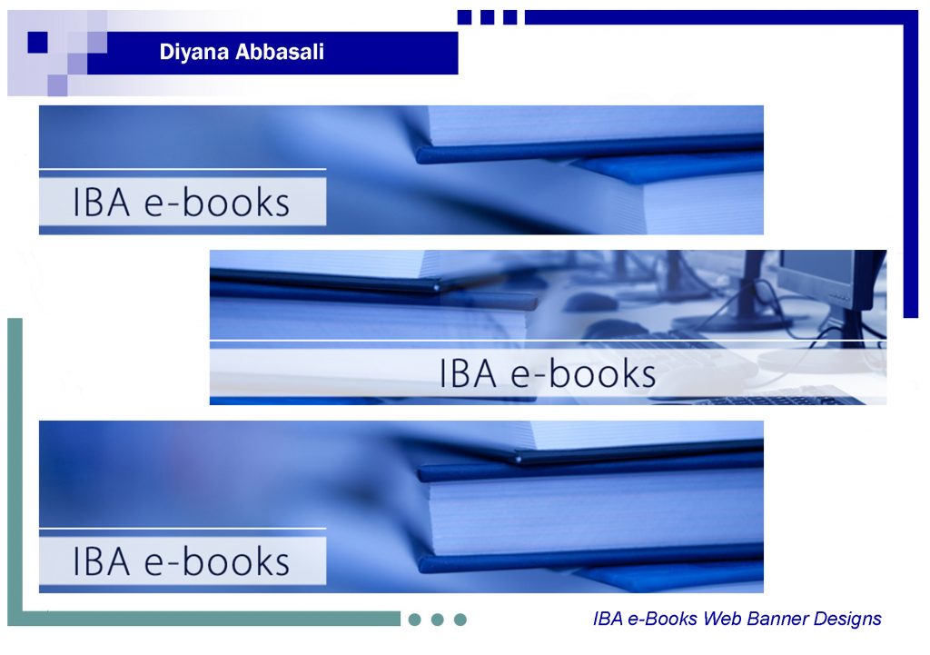
As the IBA site is now responsive in nature, banner images can be now used at full width on a page, so when designing new pages for the site or equally when updating/improving an existing one the use of imagery to help represent a pages’s content is vital. Nevertheless, before the responsive update, the use of banner images prime focus to help grab attention to a page and here are a few examples of some of the ones that I created and were used before the responsive update:
Web Design
IBA Committee index and individual committee pages
The IBA is host to over 70 committees, all with their own individual pages which publish regular news and articles for their members and/or undertake projects of relevance to their practice area. During my time at the IBA I had the task of updating both the Committee index and each committee page, not once but twice. The first was a complete design upgrade and the second was to make full use of the site’s new responsive capabilities.
Committee index page
View current committee index page
As you will see the site has gone through quite a transform from that of it’s early days of being displayed within a table. For the first redesign, I took advantage of a filter and isotope system that would aid users to search for their desired committee alphabetically. This helped to aid in easier navigation as well as saving time with having to scroll through an alphabetical list.
The use of a thumbnail image was also used to help make the page more engaging and helped to give a visual representation to the corresponding committee. The images used corresponded to the cover of each committee’s newsletter making each committee tile more recognisable to user who were members of that committee.
The second transformation of the site wasn’t too dissimilar to that of the previous design, with the added touch of background tile image rather than that of a square outlined box, with the new functionality of bootstrap each committee tile was given a background image which I created.
Committee pages – African Regional Forum
As the committee index page got a redesign so did that of the 70+ committee pages that link from the index. I was responsible for each individual committee’s corresponding webpage. For this example I will showcase the transformation of IBA’s African Regional Forum page:
View current African Regional Forum page
Similar to the index page, the 1st redesign involved a complete re-design, as the previous design was in some cases just a list of links. So for each committee page I came up with a generic template and then used this for each committee where needed. Each had their own banner image which featured at the top of the page, a series of icons/navigation images so when they were selected they would display corresponding content. For example, when ‘upcoming conferences’ was selected (the image or the text) it would then list all related conferences that the committee supported/was involved with.
The second transformation again too inspiration from the first and I didn’t change to much the overall structure of the page, the main difference was the use of a larger banner for the background and that the page was now fully responsive and when viewed on smaller devices you are able to select the content you want to view:
