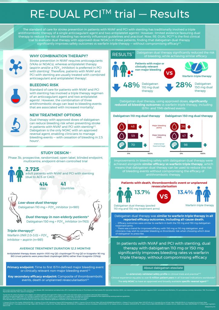
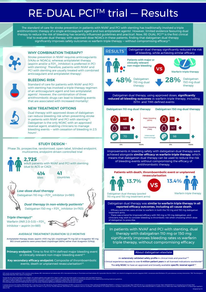
I was recently tasked with designing an A4 portrait, single page and impactful infographic for a pharmaceutical company, I came up with this design with two varying colour schemes:
Out of the two designs, I do prefer the second one and the use of the darker blue to help highlight the main titles and results. Overall I’m really happy with the design, everything can be clearly seen, and I believe their is a nice balance between text and visual/graphic content, as the brief specified that its target audience was that of medical professionals.

